It is perfectly legal to add several different plot types to the same graph. For example to mix a line plot with a filled area plot. The different plots will be stroked to the graph in the order they are added. This means that the plot (data series) that should always be visible should be added last. In the example with the filled area and a line the line should probably be added last since it otherwise most likely will be overwritten by the filled area plot.
In Figure 15.84 a basic example is shown where we have combined a line plot with an area plot.
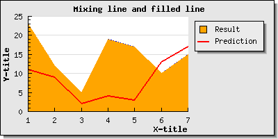
As can be seen from looking at the source to the example in Figure 15.84 there is nothing special in doing this other then to remember to include all necessary header files. So to add and mix scatter, line, error and stock graphs are pretty straightforward.
However, when it comes to mixing bar plots and lines (or area plot) there is a complication. By default bar plots are centered between the tick marks since this is the standard way of displaying bar graphs since they normally have no specific x-scale. The bars are just in an ordered sequence.
Let's just see what happens if we create a basic bar with a text scale on the x-axis and then also add a line plot to the same graph.
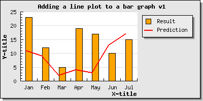
As can be seen from Figure 15.85 the line is adjusted so that each data point on the line coincides with the left edge of the barplot and the bars are still positoined in the middle of the tick marks as could be expected. This is the default behavior when combining a barplot with one of the other linear plots.
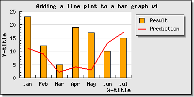
If we instead wanted the line to be centered in the barplot (when using a text scale) we would have to tell the line plot to position itself in the middle of the bars with the method
LinePlot::SetBarCenter()
Using this method would then give the result shown in Figure 15.86 below
Please note that the above discussion is only valid when using a text scale. if we instead would use (for example) an integer scale then both the bar and the line would be positioned at the exact scale values (i.e. both bars and lines would be left aligned) as can be seen in Figure 15.87

Note
As can be seen in Figure 15.87 it is possible to manually set the scale labels even if we use a linear scale like an integer scale. We only have to keep in mind that we ned to supply labels for all the scale labels and not just the one that are shown in case the scale is fro example only displaying a label on every second tick.
An example on how to combine a scatter plot and a line plot is shown in Section 18.1 where a linear regression analysis is done.